Documentation Index

Fetch the complete documentation index at: https://docs.dify.ai/llms.txt

Use this file to discover all available pages before exploring further.

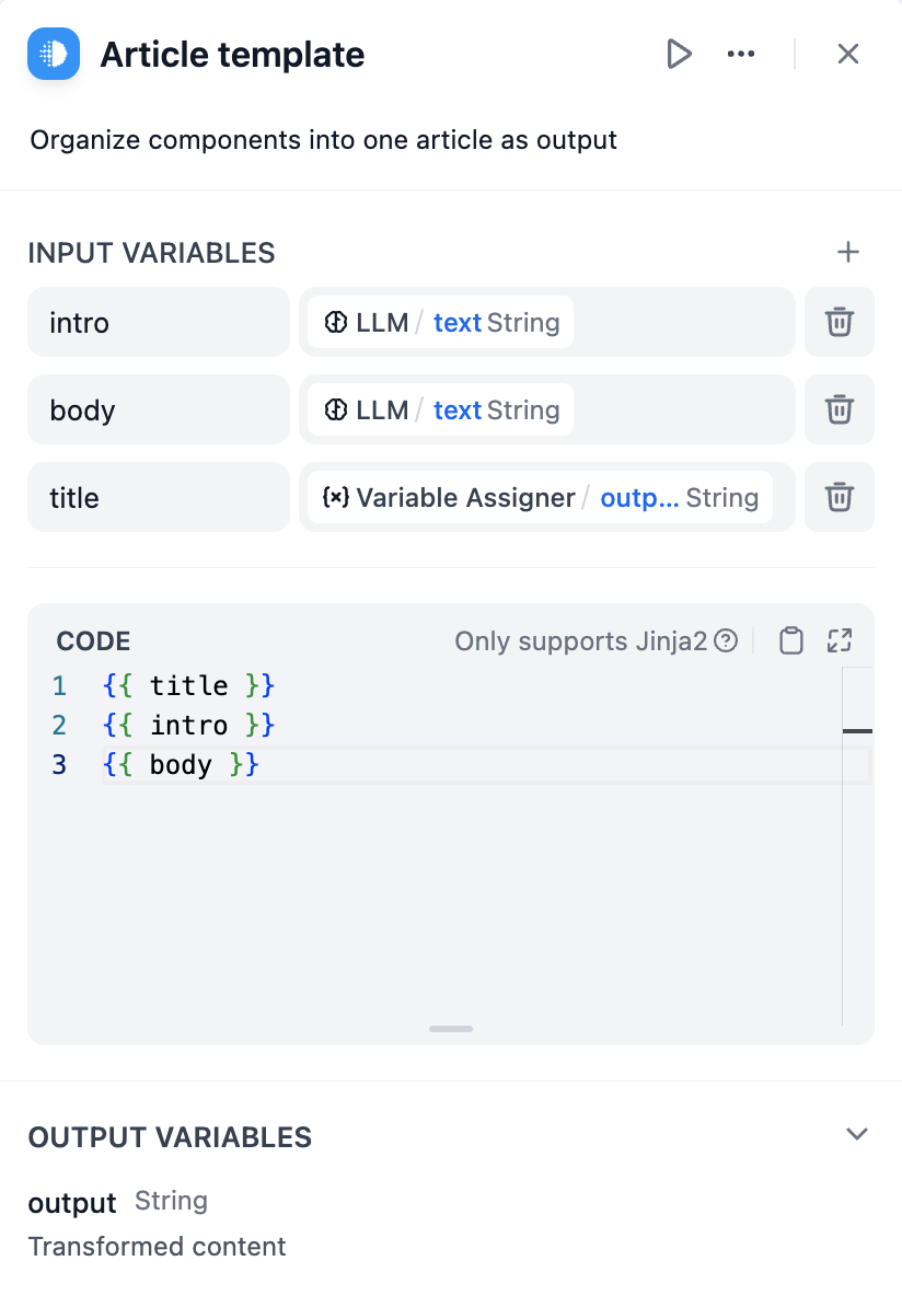
The Template node transforms and formats data from multiple sources into structured text using Jinja2 templating. Use it to combine variables, format outputs, and prepare data for downstream nodes or end users.
Template Node Configuration Interface

Jinja2 Templating

Template nodes use Jinja2 templating syntax to create dynamic content that adapts based on workflow data. This provides programming-like capabilities including loops, conditionals, and filters for sophisticated text generation.

Variable Substitution

Reference workflow variables using double curly braces: {{ variable_name }}. You can access nested object properties and array elements using dot notation and bracket syntax.
{{ user.name }}
{{ items[0].title }}
{{ data.metrics.score }}

Conditional Logic

Show different content based on data values using if-else statements:
{% if user.subscription == 'premium' %}
Welcome back, Premium Member! You have access to all features.
{% else %}
Consider upgrading to Premium for additional capabilities.
{% endif %}

Loops and Iteration

Process arrays and objects with for loops to generate repetitive content:
{% for item in search_results %}
### Result {{ loop.index }}
**Score**: {{ item.score | round(2) }}
{{ item.content }}
---
{% endfor %}
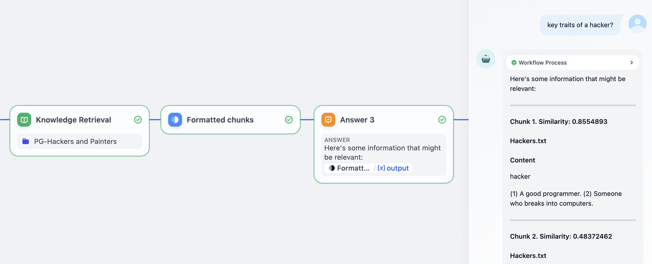
Template Processing Knowledge Retrieval Results

Data Formatting

Filters

Jinja2 filters transform data during template rendering:
{{ name | upper }}
{{ price | round(2) }}
{{ content | replace('\n', '<br>') }}
{{ tags | join(', ') }}
{{ score | default('No score available') }}

Error Handling

Handle missing or invalid data gracefully using default values and conditional checks:
{{ user.email | default('No email provided') }}
{{ metrics.accuracy | round(2) if metrics.accuracy else 'Not calculated' }}

Interactive Forms

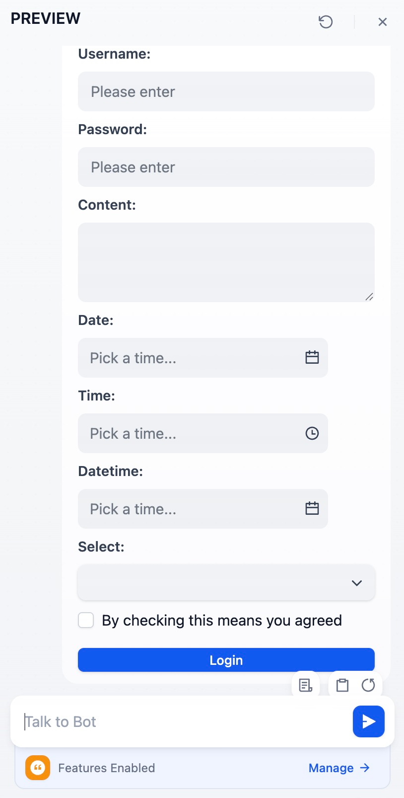
Templates can generate interactive HTML forms for structured data collection in Chatflows. On submit, the form values are sent to the chat as the end user’s next message. The format depends on the <form>’s data-format attribute:
  • data-format="json": values are serialized as a JSON object. A downstream Code node or Parameter Extractor can JSON.parse it (or pattern-match it) to pull out each field.
  • Unset (or any other value): values are sent as plain text, one name: value per line. Easier for an LLM to read.
For example:
<form data-format="json">
  <label for="username">Username:</label>
  <input type="text" name="username" placeholder="Please enter" />
  <label for="password">Password:</label>
  <input type="password" name="password" placeholder="Please enter" />
  <label for="content">Content:</label>
  <textarea name="content"></textarea>
  <label for="date">Date:</label>
  <input type="date" name="date" />
  <label for="time">Time:</label>
  <input type="time" name="time" />
  <label for="datetime">Datetime:</label>
  <input type="datetime" name="datetime" />
  <label for="select">Select:</label>
  <input type="select" name="select" data-options='["Option A","Option B","Option C"]' />
  <input type="checkbox" name="agreed" data-tip="By checking this means you agreed" />
  <button data-variant="primary">Login</button>
</form>
Interactive Form Rendered in Chat Interface

Supported Tags

Tag
AttributesNotes
<form>data-formatContainer for form fields.

Set data-format="json" to receive submissions as JSON; any other value (or unset) sends plain text.
<label>forRenders the inner text as a field label.

Set for to the field’s name to associate them. Place the <label> before its field in the source so it appears above.
<input>type, name, value, placeholder, checked, data-tip, data-optionsSee input types below. name is required for the field to appear in the submission and must match [A-Za-z][A-Za-z0-9_-]*.
<textarea>name, placeholder, valueMulti-line text input.
<button>data-variant, data-sizeSubmits the form.
  • Variants: primary, warning, secondary, secondary-accent, ghost, ghost-accent, tertiary.
  • Sizes: small, medium, large.
Values outside these lists are ignored and the button falls back to the default styling.

Ignores data-message and data-link, which only apply to quick-reply buttons.
Do not leave blank lines between tags inside <form>. A blank line ends the HTML block during markdown parsing, and any tags after the break will fail to render as form fields.

Supported Input Types

type valueRenders asSubmitted as
text, password, email, numberSingle-line input with matching HTML semanticsString
dateDate pickerISO date string (e.g., 2026-01-10)
datetimeDate picker with time selectionISO date-time string (e.g., 2026-01-10T14:30:00.000+08:00)
timeTime pickerString (includes a full date prefix, not just the time)
checkboxCheckbox followed by the data-tip text as a labelBoolean (true or false)
selectDropdown built from the data-options JSON array of stringsSelected option string
hiddenRenders as an <input type="hidden"> element; not visible in the UIString
  • Any other type value renders an “Unsupported tag” fallback in place of the field.
  • HTML5 validation attributes such as required, min, max, and pattern are not enforced.
  • Browsers may autofill <input type="password"> and <input type="email"> with saved credentials for the current site; use <input type="text"> for fields that should not be prefilled.

Quick-Reply Buttons

A standalone <button> placed outside any <form> renders as a clickable button in the chat. Use these to offer canned responses or external links inline with the assistant’s message. For example:
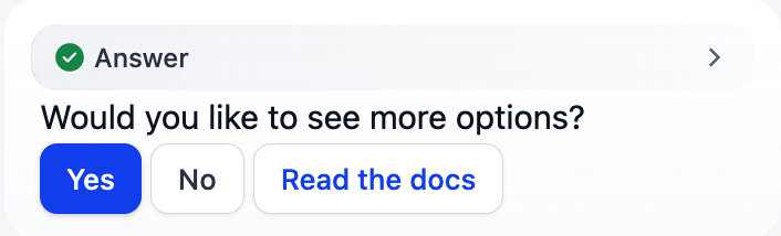
Would you like to see more options?
<button data-variant="primary" data-message="Yes, show me more">Yes</button> <button data-variant="secondary" data-message="No, that is enough">No</button> <button data-variant="secondary-accent" data-link="https://docs.dify.ai">Read the docs</button>
Quick Reply Button
AttributeClick behavior
data-messageSends the text as the end user’s next chat message.
data-linkOpens the URL in a new tab. Must be a valid URL.
If both are set, data-link takes precedence. A button with neither renders but performs no action when clicked. Apply data-variant and data-size for styling, using the same values listed for form buttons above.
Unlike form buttons, standalone buttons pass data-variant and data-size through to the underlying component without validation. An unrecognized value can leave the button rendered as plain text rather than a styled button.Use only the values listed above.

Output Limits

Template output is limited to 400,000 characters (configurable via TEMPLATE_TRANSFORM_MAX_LENGTH). This prevents memory issues and ensures reasonable processing times for large template outputs.